
Example 3: Dark Matter#
In this example we’ll consider a more scientifically motivated problem. Astrophysically, dark matter is observed to fall into spherically symmetric arrangements called “haloes”. As a function of spherical radius \(r\), the density profile of a halo is typically taken to be the Navarro-Frenk-White (NFW) profile:
This is a 2-parameter profile, with a density scaling \(\rho_0\) serving as a normalisation, and a scale radius \(r_s\). This is essentially double power law: \(\rho \propto r^{-1}\) where \(r \ll r_s\) and \(\rho \propto r^{-3}\) where \(r \gg r_s\).
For the Milky Way, reasonable values are \(\rho_0 \approx 4 \times 10^{-22}~\mathrm{kg/m^3} \approx 0.006~\mathrm{M}_\odot / \mathrm{pc}^3\) and \(r_s \approx 6 \times 10^{20}~\mathrm{m}\approx 20~\mathrm{kpc}\). We don’t need to worry so much about \(\rho_0\) as it simply sets the overall normalisation.
In our case, we’ll place 2 such haloes in a 3D box and sample some dark matter particles.
It’s worth noting that the mass of the NFW profile is divergent unless cut off at some radius. The choice of this radius is a slightly thorny issue, but we’ll just say that the density cuts to zero at \(10 r_s\).
Python preamble#
Imports
import numpy as np
import matplotlib.pyplot as plt
from matplotlib.colors import LogNorm
Matplotlib style file
plt.style.use('figstyle.mplstyle')
Set up RNG (this is optional, but it makes results reproducible)
rng = np.random.default_rng(42)
NFW density#
Function to evaluate density as function of position and halo parameters. A thing to note here is the q + 1e-1 in the denominator of the density, which didn’t appear in the equation above. This is a way to deal with the divergence at \(r=0\): this way when \(r \ll r_s\), the density approaches a constant \(\rho \rightarrow \rho(r=10^{-3}r_s)\).
def NFW_density_vectorized(X, rho_0, r_s):
    r = np.linalg.norm(X, axis=-1)
    q = r / r_s
    rho = rho_0 / ((q + 1e-1) * (1 + q)**2)
    m = q > 10
    if np.any(m==True): rho[m] = 0
    return rho

def NFW_density(X, rho_0, r_s):
    r = np.linalg.norm(X, axis=-1)
    q = r / r_s
    if q > 10:
        return 0
    rho = rho_0 / ((q + 1e-1) * (1 + q)**2)
    return rho
Creating halo points with LintSampler#
from lintsampler import LintSampler
Let’s do two haloes at different locations, both with scale radii of 0.5 (we could call the units kpc, but really the code is agnostic), but with differing values of \(\rho_0\). As it just sets a normalisation, we don’t actually need to worry about the precise value of \(\rho_0\), only the relative values between the two haloes. The total halo mass is proportional to \(\rho_0\), so we’ll give one halo twice the \(\rho_0\) of the other and recheck later that it got twice the particles.
First, we prepare the pdf, including setting the parameters for each halo:
def two_halo_pdf_vectorized(X,centres, rho_0s, scale_radii):
    return np.sum([NFW_density_vectorized(X-centres[h], rho_0s[h], scale_radii[h]) for h in range(0,len(centres))],axis=0)


def two_halo_pdf(X,centres, rho_0s, scale_radii):
    return np.sum([NFW_density(X-centres[h], rho_0s[h], scale_radii[h]) for h in range(0,len(centres))])

centres = [np.array([0.5, -2.5, 3.0]),np.array([-2.5, -2.0, -5.5])]
rho_0s = [1.0,2.0]
scale_radii = [0.5,0.5]
Next, we set up the grid we want to sample on:
# grid sizes: outer grid is 128^3, but central 32^3 replaced with 128^3
N_grid = 128

# set up grid boundaries
h = 15
Xedges = np.linspace(-h, h, N_grid + 1)
And set up the sampling instance (using the vectorized pdf, but you can test the speed against the non-vectorized if you wish!):
L = LintSampler((Xedges,Xedges,Xedges),pdf=two_halo_pdf_vectorized,vectorizedpdf=True,pdf_args=(centres,rho_0s,scale_radii))
Lastly, draw the samples.
X = L.sample(N=1000000)
To visualise, we’ll first make a histogram as in previous examples:
plt.hist2d(X[:, 0], X[:, 1], bins=np.linspace(-10, 10, 1000), density=True)
plt.gca().set_aspect('equal', adjustable='box')

plt.colorbar();
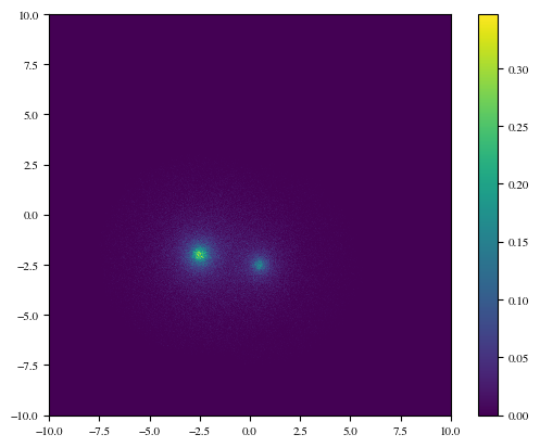
This doesn’t look particularly impressive. The thing is that power law functions like the NFW profile have a vast dynamic range, so plotting density in linear space will show you the peak and not much else. Let’s instead use a log-scale colour map:
plt.hist2d(X[:, 0], X[:, 1], bins=np.linspace(-10, 10, 1000), density=True, norm=LogNorm())
plt.gca().set_aspect('equal', adjustable='box')
plt.colorbar();
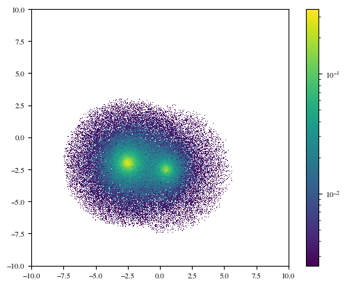
We can see now that the haloes appear to overlap considerably, at least in \(x\) and \(y\). However, if we choose a different projection, e.g. \(x-z\):
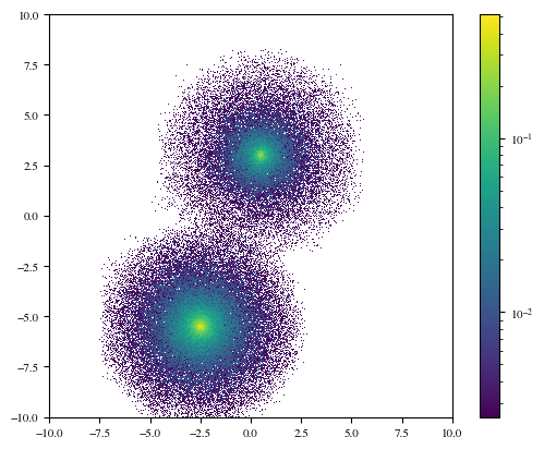
plt.hist2d(X[:, 0], X[:, 2], bins=np.linspace(-10, 10, 1000), density=True, norm=LogNorm())
plt.plot([-10, 10], [-1.5, -1.5], c='k', ls='dashed')
plt.xlim(-10, 10)
plt.gca().set_aspect('equal', adjustable='box')
plt.colorbar();

Still some overlap, but overall the haloes seem to separate much more cleanly in \(z\). We can use this to test whether an appropriate number of particles has been sampled in each halo. The lower halo in this plot has twice the mass of the upper halo (because its \(\rho_0\) parameter was doubled), so it should have twice the particles. If we take a horizontal line at \(z=-1.25\) (the dashed line in the plot), then virtually all of the particles above/below the line will belong to the upper/lower halo (with some cross-contamination).
m = X[:, 2] > -1.25
print(f"Upper halo fraction: {m.sum() / len(m): .3f}")
print(f"Lower halo fraction: {1 - m.sum() / len(m): .3f}")
Upper halo fraction:  0.336
Lower halo fraction:  0.664
Looks great!
Can we do better?#
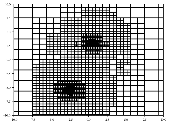
We also have DensityTree as an option for sampling from the pdf, with a specified error tolerance. DensityTree provides an adaptive way to partition the domain, such that a desired accuracy may be achieved.
from lintsampler import DensityTree
We’ll start with a very coarse grid and let the tree refinement do most of the work.
tree = DensityTree(mins=np.array([-h,-h,-h]), maxs=np.array([h,h,h]), pdf=two_halo_pdf_vectorized, vectorizedpdf=True, min_openings=4,pdf_args=(centres,rho_0s,scale_radii))
We’ll choose fairly ambitious tolerances: 0.02% accuracy in the total tree. We are also using the control parameter leaf_mass_contribution_tol, which prevents cells from too low mass (in this case less than 0.1% of the mean cell mass) from further refining. These tend to be low density cells, which may have large fractional errors, but small absolute errors.
tree.refine(0.0002,leaf_mass_contribution_tol=0.001)
We can visualise the refinement of the tree:
from matplotlib.patches import Rectangle
fig = plt.figure()
ax = fig.add_subplot(111)

for leaf in tree.leaves:
    rect = Rectangle((leaf.x[0], leaf.x[2]), leaf.dx[0], leaf.dx[2], lw=1, facecolor='none', ec='k', alpha=0.6)
    ax.add_patch(rect)
ax.set_xlim(-10, 10)
ax.set_ylim(-10, 10)
(-10.0, 10.0)
And then sample from the tree:
sampler = LintSampler(domain=tree,seed=rng)
X = sampler.sample(N=1000000)
Lastly, visualise to compare with our results before:
plt.hist2d(X[:, 0], X[:, 2], bins=np.linspace(-10, 10, 1000), density=True, norm=LogNorm())
plt.gca().set_aspect('equal', adjustable='box')
plt.colorbar();
While we do see some tree artefacts, notice that with DensityTree we are more accurately representing the very low-density outskirts of the NFW profile. We could remove the artefacts by decreasing the tolerance – at the expense of more computational time. Choose tolerances that are appropriate for your problem!